Hello friends!
Hope you all had a nice Thanksgiving and a relaxing holiday weekend. This will be my lengthiest letter to you so far - this month I’m diving into the topic of style. It’s an expansive discussion, so without further ado - let’s get to it.
Developing Your Illustration Style
Ever see an image in a magazine or on a website and immediately know who the artist is? That's what having a well defined illustration style means. People come to know the look and feel of your work - it becomes recognizable and distinct, something you're known, and ideally, hired for. A well defined illustration style helps an art director know which projects to assign you and gives a client an idea of what a finished product may look like if they work with you.
Along with pricing, style is probably one of the main topics of preoccupation among illustrators. I know when I was starting out in illustration I spent many hours thinking (that's code for stressing) about defining my style. After a few years of illustrating full-time, I feel I have a more distinct understanding of the topic. It's a big one, and there are plenty of rabbit holes I won't cover here, but I hope this can be helpful in how you think about your artwork and style moving forward.
Styling How to Think
A mistake I made early on was approaching my illustration style as something to be selected or decided upon instead of viewing it as a process of slowing refining the natural way in which I already do something. Short of lifting another artist's style (which, don't) there's no shortcut or quick fix to developing your personal aesthetic.
You may know of the thought experiment Ship of Theseus - Theseus sailed a ship made entirely of wood. Over time, some pieces of the ship began to rot. When that happened, the rotten pieces would be replaced with metal. Eventually, the entire ship was made of metal with none of the original wooden pieces remaining.
My mind always returns to this concept when I think about developing an illustration style. It's a constant process of swapping and iterating - bit by bit, piece by piece, discarding elements that no longer serve while introducing new details or processes. This framing helps me to avoid the ever-temping notion of "done" - it is unlikely you will ever have a 100% finalized style. I've had many moments along the way where I finish an illustration and think to myself "Now this is my style! I've finally found it, I'm done!". But time goes by and I look back at that same illustration and see things I'd do differently, or details I loved at the time, but eventually shifted away from.
I also find this analogy useful in that it makes the whole process less overwhelming. You don’t need to build the entire ship all at once. You just need to go piece by piece, slowing crafting it naturally over time. Style is informed both by conscious decisions you make, as well as unconscious factors such a skill, taste, and process. Working on your style will be an ongoing journey of defining, testing, and embracing yourself as an artist.
All of this is not to say that you'll always be adrift (I guess I'm just doing sailing/water references now?) in your style, wandering aimlessly between aesthetics. Each iteration is like an image slowing coming into focus, a gradual sharpening of how you'd like your work to look and feel.
But enough with the abstract (or not, I love abstract thought and could lament on this shit all day long, but alas) let's take a little trip back through my own illustration style so I can show you what I mean more practically.
Ye Days of Old (2014-ish)
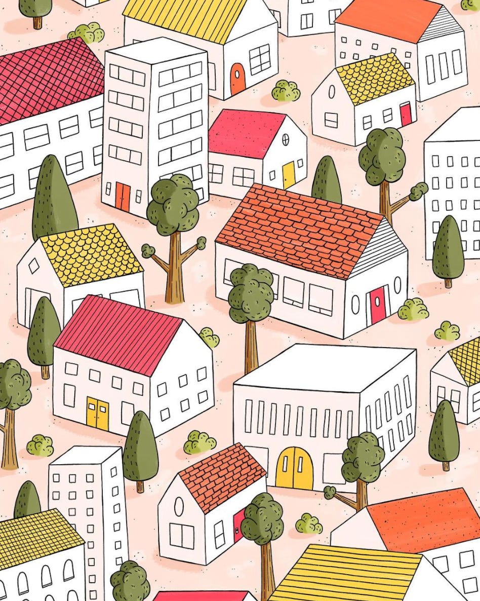
Way back then there was no Apple Pencil or Procreate (at least for me). Instead, my process was pencil sketching on tracing paper, inking my lines with Micron pens, scanning the artwork onto my computer, live-tracing it in Illustrator, and finally bringing it into Photoshop to digitally color with a ramshackle collection of brushes I'd found along the way.
This process heavily defined my initial illustration style - my work then was marked by black outlines throughout. This was partly because it was my natural inclination to draw this way, and partly because the way in which I worked necessitated it. It would have been near impossible to work in the more shape-based way I do now with this workflow.
Aside from technical restrictions, this was also the very beginnings of my illustration work. I experimented a lot. I tried different mediums. I did the same piece in different styles. Don't be discouraged from casting a wide net and slowing narrowing in from there. You'll only discover what you like from doing a lot that you don't.
I think back on this time as my "doing the most" phase. Young illustrators or those just starting out tend to go through a "doing the most" phase - you throw everything you've got at the artwork. Partly because your eye for editing isn't sharp yet, and partly because you want to use each project to really prove what you can do. I was using complex perspectives, textures and shading, and various line treatments.
If you feel that you're going through a "doing the most" phase, just KISS it, baby! That's code for Keep It Simple, Stupid. And it's a reminder to always try to simplify and pare down. If you feel stuck, try subtracting or refining rather than adding or expanding.
Now I’m Getting Somewhere
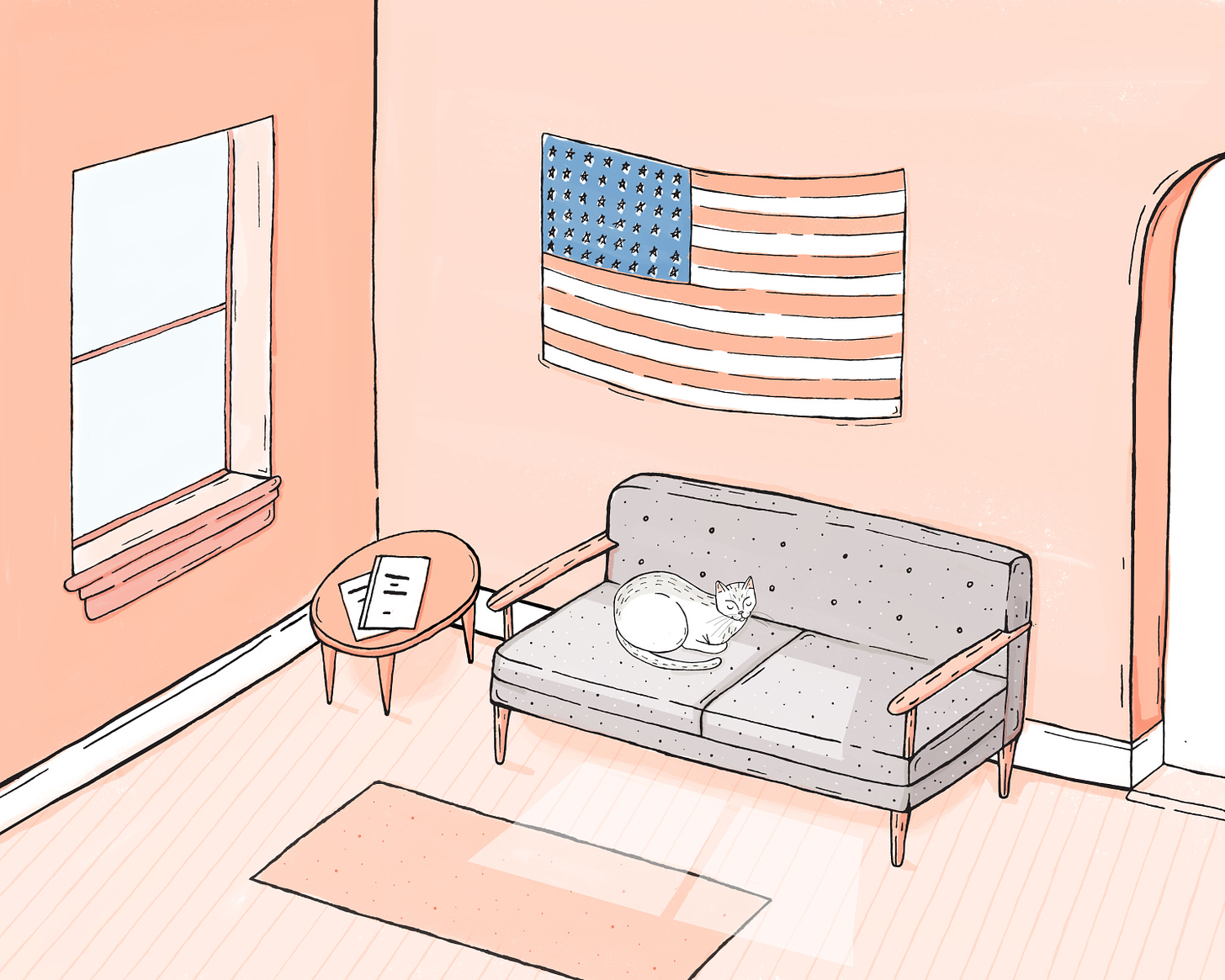
Oh joyous day when I got my first iPad and Apple Pencil. Initially I continued to work in the same style - black outlines throughout with color beneath. With a new medium and technology though, I started to see the possibility of trying something different. I began to discard the black lines almost entirely, and to focus more on shape and texture.
This was definitely a step in the right direction, although I came to feel that completely discarding the black lines was a step too far. It gave my work a somewhat washed out, unfocused feeling. So I iterated again.
The best of both worlds
The result was a happy medium between the two. I came around to including some black line work for detailing, but still allowing the shape and texture to be the dominant force. This is the combination my work has relied on few a few years now.
Separately, there's been a gradual shift in my style that came about just from drawing often and getting better. This is the unconscious factor I mentioned previously - your style will grow and evolve even if you don't make conscious changes to it. You'll just get better at what you do and it will naturally sharpen the work you make. This is another reason why constantly iterating is so important aside from trial and error - it's practice!
These days I feel that I've settled into a nice place stylistically (now that I've put that into the universe I expect to have an existential breakdown in which I hate everything I make but hey, what can you do), which has allowed me to explore and experiment further conceptually.
Something I've become aware of lately is that I’ve perhaps tightened and focused my work a bit too much - sometimes I finish illustrations and they feel too rigid or detailed. Recently I've tried to find ways to bring looseness and movement back into my artwork. Iterating isn't always moving forward - sometimes it's recognizing when you've gone too far in one direction and need to turn back. I've had many of those moments along the way, and will no doubt have many more. But I also keep in mind that no matter how many parts of the ship I replace, in the end it's still my vessel and my journey.
So, that's a brief foray through the last few years of my work. This isn't a specific roadmap to follow rather a candid look at my process along the way. Creating is very intimate and personal, but it's also important to take an objective, clinical look at your work every now and again to see where you've been and where you'd like to go.
Some Closing Thoughts…
Do I need to work in just one style?
This topic gets stirred up every now and then on Twitter and I don't often participate because 1. arguing with people on the internet has to be one of the worst actives you can engage in, and 2. I think it's asking the wrong question. You should push yourself to experiment and try various styles and techniques. But the real question here is how you edit and present your work. Just because you can work in various styles doesn't mean every single one of those needs to be present on your website or portfolio.
Ask yourself what style you enjoy working in and what style you'd like to be hired for - that will help you decide what work to showcase. If you just draw and share for fun, by all means go wild. But if you want art directors or clients to seek you out for something specific, think about how to best show them what you do and what you do well. They want to know what to expect if they work with you, not have to guess which of the multiple styles you'll deliver for this particular project. When in doubt, aim for KISS instead of 'doing the most'.
Where do I even begin?
Just start drawing (or writing, or making - this applies to any creative outlets). We all have a unique and inherent way of creating. Pick 5 things to draw - a cat, a plant, a car, whatever - and allow yourself to draw it without judgement. Draw for memory or from a reference photo. Just do what feels natural to you and see what comes of it. Now compare your drawing to a drawing of the same object by another artist. What's different? How did they interpret a cat differently than you did? What do you like or dislike about their treatment? What's distinct about your drawing? Can you take that distinct element and push it further? Can you exaggerate it? Can you twist it around a bit? The goal is to work with yourself here, not against. Try to expand upon what you're naturally inclined to do and see where it takes you.
How do I know what iterations to make or what things to try?
Make a Pinterest board and pin 30-40 illustrations you really like. Don't try to edit too much at the start, just save things that jump out to you. Once you have those gathered, sift through and see what patterns emerge. What do the images have in common? Do they use a similar color palette? Black outlines? No outlines? Painterly? Graphic? Start to find common threads in the artwork you like and try applying that to your own work. Again, I'm not saying to copy what anyone else is doing. But start to train yourself to identify the visual elements you gravitate toward and then use those insights to iterate on you own artwork.
I still have lots of questions about style that you didn't cover, you fraud.
I'm sure you do! My initial outline for this piece had quite a bit more that I ultimately needed to cut for length and clarity - it's a sprawling topic. I would love to delve further into specifics, so please leave a comment if there's a certain aspect of style you'd like to ponder with me in future newsletters.
Additional resources
Austin Kleon's book 'Steal Like an Artist' is a much deeper dive into the idea of iterating on different ideas and techniques within your work. If you've taken the time to read this, you'll definitely get a lot from this book.
Whisper of the Heart - my favorite Studio Ghibli film. It's beautiful and fun to watch regardless, but a central theme of the story is slowly polishing your voice and talents. It might not be super actionable, but it's a great meditation on the overall process.
The Older Work of Artists You Like -
Be shameless and scroll way back on their Instagram feed. If that fails, try sifting through Pinterest - you can usually find earlier work that they've likely removed from their website or Instagram over time. It's really fun and insightful when you start to see the evolution of the work of people you admire.
Try applying this to other disciplines as well - filmmakers, musicians, authors, etc. I'm a big fan of Haruki Murakami and find his earlier books to be quite different stylistically than newer ones. Are you a fan of Wes Anderson? Watch a few of his films in order of release and note what he does differently over time.
The more you do this the more fun and powerful it feels - it's like getting a little glimpse into someone's mind and decision making process as they grow over time.
Last day for 50% my prints on Society6!
If you've been wanting to buy one of my prints, now is the perfect time. I don't have control over the discounts (they're set by Society6) and I think this is the first time I've seen 50% off since I've been using their platform. Check out my shop, your discount should be automatically applied at checkout.
Reading, Watching, Listening, Enjoying
Reading:
The Searcher by Tana French
Sandwich Magazine
Watching:
The Crown (I skipped seasons 1-3 so I could get right to Gillian Anderson)(Netflix)
How To with John Wilson (HBO)
Way too much Shark Tank (Hulu)
Listening:
Ho Yeah! (A podcast discussion of every single King of the Hill episode!!)
Randall Stevens - The Music I Love Is Gospel
Barry Walker Jr. - Shoulda Zenith
Enjoying:
Thanksgiving leftovers, including this kale salad from Joshua McFadden’s recipe
Thank you as always for reading and subscribing. Would love to hear your thoughts in the comments (just please don’t yell at me, I’m too delicate to be yelled at on the internet). Next month I’ll have my final letter of 2020 for you. Until then!


